(215) 420-9423 | CALL TODAY FOR FREE ESTIMATE

What Are The Meaning Behind The Different Colors?
Find Out The Different Color Meanings Here!
Symbolism of color? What are the four colors? Do you know? What do colors mean psychologically? Color personality? What does all this mean? Let's dive in and look at all the different aspects of colors, shall we?
Colors have been used forever to enhance someone's mood, invoke emotion, and trick people's minds so the company can make that sale. Businesses have used colors in marketing campaigns, company logos, and websites for years to get into your subconscious so you buy buy buy.
What are the four colors? I'm referring to The Four Color Personalities: Orange, Gold, Green, and Blue. Each color represents a different primary personality type, and all four lay the foundation of True Colors' fun and insightful personality-identification system.
ORANGE
ENERGETIC
SPONTANEOUS
CHARMING
oriented and comfortable taking risks. You probably also tend to be competitive and seek adventures with opportunities to push the boundaries. Living in the moment and enjoying an adaptable time schedule are important to you.
GOLD
PUNCTUAL
ORGANIZED
PRECISE
Punctual, organized, and precise. “Golds” tend to need structure and organization. If you’re a Gold, then order, rules, respect, and dependability are important to you. Time is a key part of your life if you’re a Gold personality type. You need to be on time and want others to be punctual. Following the plan or schedule is best for you.
GREEN
ANALYTICAL
INTUITIVE
VISIONARY
Analytical, intuitive, and visionary. These are traits of the Green Personality type. “Greens” find innovative thinking and problem solving exciting. If you’re a Green, you tend to see the big picture and effectively analyze situations. Thinking outside the box is a real strength. You also have an extreme need to be right.
BLUE
EMPATHETIC
COMPASSIONATE
COOPERATIVE
Empathetic, compassionate, and cooperative. “Blues” tend to be very social people. If you’re a Blue, you value relationships and harmony. Genuine kindness, sincerity, and compassion are important to you. You enjoy opportunities to work with others and collaborate, and any opportunity to develop a connection.
Here's a little insight into the Psychology of Colors in Marketing. According to CoSchedule Blog. Very good information on everything color, well done.
Red is a powerful, dynamic color that reflects our physical needs, whether to show affection and love, or to portray terror, fear, and survival. Red is also a very energizing color that can portray friendliness and strength, but can also be demanding and show aggression depending on its context. If you're looking to have a powerful presence or get someone's attention fast, red is your go-to color. Just remember to use it sparingly to avoid the extreme negative reactions it can so easily awaken.
Red is commonly seen: Stop lights, Valentine's Day, and horror films.
Orange has a very interesting psychological meaning, as it combines red's power and energy with yellow's friendliness and fun. The mix makes orange a good representation of physical comfort in our warmth, food, and shelter. (It even stimulates our appetite) Orange is also known to be a color of motivation, lends a positive attitude, and general enthusiasm for life. Overall, orange is great for bringing comfort in tough times, and creating a sense of fun or freedom in your visuals.
Orange is commonly seen: fruits, sporting events, and board games.
Hi-Light to read the Yellow. Directions how to highlight here
Yellow is the epitome of joy, happiness, cheerfulness, optimism—you name it. Anything happy is almost always yellow. The wavelength of yellow is particularly long, making it one of the most powerful psychological meanings, while also being the easiest color to visibly see. (Did you know yellow is the first color infants respond to?) Whenever you need to lift someone's spirits, increase their confidence, or provide inspiration, use Yellow. However, avoid using yellow too much, because it's also known to make us more critical, causing self-esteem issues, fear, or anxiety. Find the right balance of yellow to motivate, rather than bring others down.
Yellow is commonly seen: traffic crossing and signs, smiley faces, and window-front displays.
Green is a color of balance and harmony. It lends us a clear sense of right from wrong, since green incorporates a balance of both the logical and emotional. Green is one of the most-seen colors in nature, reflecting life, rest, and peace. Green is one of the most-seen colors in nature reflecting life, rest, and peace. It is also a sign of growth, whether in a physical object like plants or in our income and wealth. Overall, if you're looking to portray health, rest, and relieve stress, green is your color. While green has minor negative aspects like over-possession and materialism, it has a more positive effect than most other colors. I'll take some green please...
Green is commonly seen: Nature, economic exchange, health-based stores, and restaurants.
Blue is known for its trust and dependability. It's reliable, responsible, and mentally soothing. For that reason alone, it's one of the most-liked colors in the world. Unlike red, blue lends a more mental reaction than physical, which allows us to distress, calm down, and think of the most ideal situation. Unfortunately, it is also one of the last colors to be seen, and can be perceived as distant, cold, or unfriendly if used in great amounts.
Blue is a well-liked color that can bring a sense of calmness and trust when building relationships, especially in marketing.
Blue is commonly seen: Workout facilities, hospitals, and spas.
Purple is most commonly known for its imagination and spirituality. It possesses the energy and power of red, with the stability and reliability of blue, making it a perfect balance between the physical and spiritual. Purple is often used to show luxury, loyalty, courage, mystery, and magic.
It's a fascinating color, as it soothes, but also presents space for mystery and new ideas. This is why creativity is most often associated with the color purple. When using purple, avoid using it too often, as it can also cause too much introspection or distraction as thoughts begin to wander.
Purple is commonly seen: Magic shows, fairy tales, and luxury products.
Pink is a softer, less intense version of red that creates a sense of compassion and unconditional love. While it's a very physical color, it soothes rather than stimulates, making it a perfect color for caring, understanding, and nurturing those in need.
Pink is a sign of hope. It is also known to be romantic, as it shows empathy and sensitivity. If too much pink is used, it can be draining, show a lack of power, and even immature. Pink can be a great counter-option to the color red when used appropriately.
Pink is commonly seen: Cancer patients, little kid objects, and bathroom products.
Brown, while maybe not the most visual stimulating color, is a great sign of structure, security, and protection. Whether it's family, friends, and material possessions, Brown offers constant support.
It's also a serious, down to earth color you can use, where black might be too intense. The downfall to brown is that it's the safest color and can seem reserved, scheduled, and boring. Use it when necessary, but don't depend on it too heavily.
Brown is commonly seen: Campgrounds, home furnishings, and coffee shops.
Gold has quite a few meanings depending on your culture. Across the world, though, gold consistently represents some variation of charm, confidence, luxury, and treasure. It can also have an element of friendliness, abundance, and prosperity that is naturally attractive. Too much gold, however, can seem egotistical, proud, and self-righteous. Similar to colors like brown and black, try to use gold more sparingly to highlight rather than be the main attraction.
Gold is commonly seen: Luxury products, rings, and trophies.
Black is a color of sophistication, seriousness, control, and independence. Although, it can also be used to show evil, mystery, depression, and even death. Black is a reserved color that lacks any light, as it's an absence of all the colors. It likes to stay hidden, in control, and separate from others. For this reason, black is a great color for high contrast and easy legibility. Unfortunately, since it's a powerful color, too much black can cause sadness and negativity, so use it sparingly and in your text more so than the visuals itself.
Black is commonly seen: Professional attire, luxury products, and limos.
White is color that is complete and pure, making it a perfect example of purity, innocence, cleanliness, and peace. White can also represent new beginnings, providing a blank slate, and gives refreshment for new ideas. Since white has an equal balance of all the colors, it can exemplify several meanings, with equality outweighing them all. White is a great color for simplicity, cleanliness, and idea creation. However, avoid using too much white, as it can cause isolation, loneliness, and emptiness.
White is commonly seen: weddings, website backgrounds, and doctor's waiting rooms.
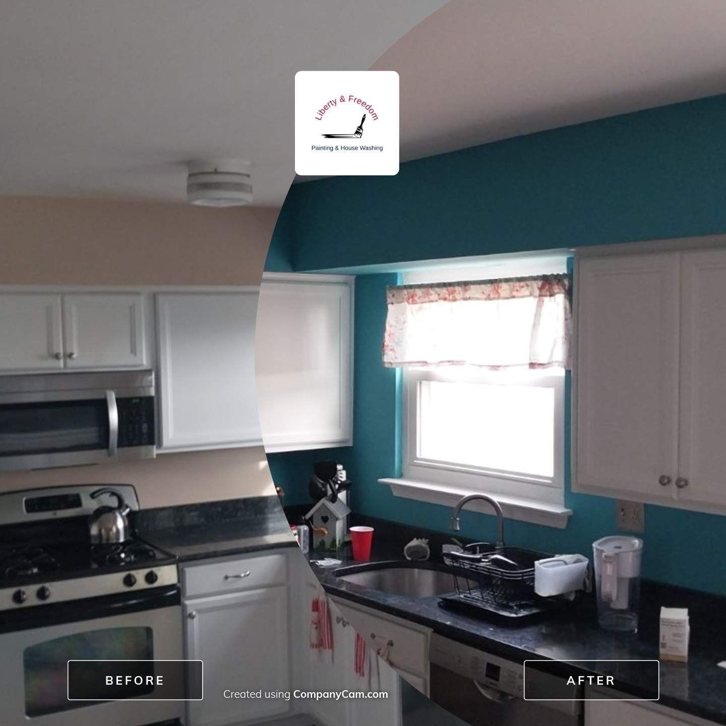
If color interests you, might I suggest you head over to TheCoSchedule Blog "The Know It All Guide To Color Psychology In Marketing + The Best Hex Chart"? It's great information. Anything you need color. Being a painter can come in handy. I was never into color before until I saw my recent customer make her own colors for her house out of store, left overs and no wanted tints.
Check out these pics. It's a little blue print or flow chart of which colors she used, and what colors she created, and what colored paint was used to make those colors. Also, a couple pics of the paint being created.


Share
The Painter's Journal